Glows beyond expectations: Nothing Phone (2a) Plus Community Edition reflects a collective vision of consumers and inventors | Technology News
 Plus Community Edition reflects a collective vision of consumers and inventors | Technology News")
London-based consumer tech brand Nothing has accomplished a new feat that no other smartphone brand dreamt of. Phone (2a) Plus Community Edition—designed entirely by community members in collaboration with the engineers at the company––is first of its kind.
From the smartphone to its packaging, every single aspect of the Nothing Phone (2a) Plus Community Edition is a result of this collaboration. Nothing ran a four-stage global competition—hardware design, wallpaper design, packaging design, and marketing campaign—to find talent. Nothing’s design studio has worked closely with the winners Astrid Vanhuyse & Kenta Akasaki, Andrés Mateos, Ian Henry Simmonds, and Sonya Palma to refine the winning concepts to make it fit for a consumer product.
Priced at Rs 29,999, this is a limited drop, and the company is only producing 1,000 units globally, and will be available for purchase starting November 12. One needs a unique link to purchase this device, and it will only be made available to Nothing community members.
Nothing that glows in the dark
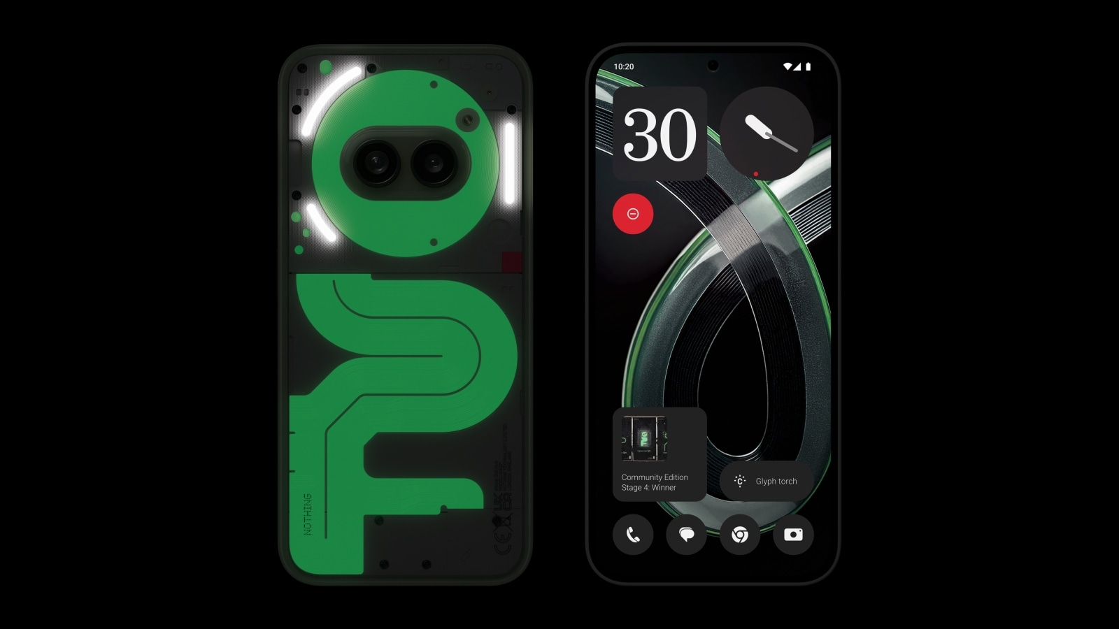 Nothing will only make 1000 units of this smartphone. (Image credit: Nothing)
The company’s first community edition–– a glow-in-the-dark smartphone––takes it a notch up with a green-tinted phosphorescent material that stores ultraviolet rays and emits luminescence without generating any heat. Previously, this has been spotted on some analogue wristwatches.
Indianexpress.com spoke to Mattia D, head of community at Nothing, to understand the complexities involved in bringing the Nothing Phone (2a) Plus Community Edition to life.
Here are the edited excerpts of the conversation.

Q. How challenging was it to bring a community member’s concept to life?
Mattia D: Unlike traditional product development, the Community Edition required a dynamic, adaptive approach. Our most ambitious community project yet, it spanned nine months, featuring over 900 entries from 47 countries.
Nothing ran a four-stage global competition—hardware design, wallpaper design, packaging design, and marketing campaign—to find talent. Co-creation remains central to Nothing, with ongoing collaborations on software and content.
Bringing a community member’s concept to life was thrilling and challenging. Collaborating closely with winners Astrid, Kenta, Andrés, Ian, and Sonya, our design and creative teams refined each concept, navigating fresh directions like the innovative glowing design. This process ensured that each idea aligned with our brand while honouring the unique visions of our community members.
Q: What was the most difficult feature to implement in the Phone (2a) Plus Community Edition?
Mattia D: The biggest challenge of the Phone (2a) Plus Community Edition was integrating diverse elements conceived by our community members. Astrid and Kenta collaborated with Nothing’s design director Adam Bates on hardware design, exploring materials and colours to embody the “Phosphorescence” concept. Guided by software design director Mladden, Andrés expanded the “Connected Collection” wallpapers from four to six using AI and digital design. Ian, blending his 3D and fashion expertise, reimagined packaging with his “Less is More” approach, while Sonya developed the campaign theme “Find your light. Capture your light” with the Nothing Creative team.
Community Winners inputs: (Name: Kenta & Astrid)
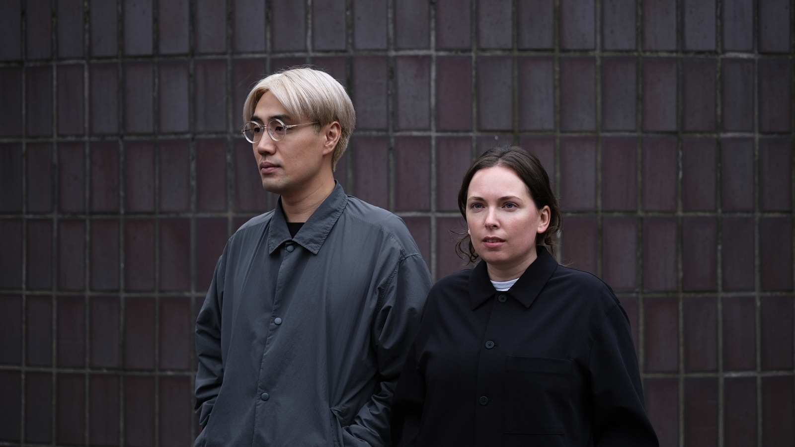 Kenta and Astrid, the community members who designed the phone. (Image credit: Nothing)
1. What inspired you to choose the glow-in-the-dark theme?
We didn’t want to just make a beautiful object or pick a colour, since that can feel subjective. We wanted the design to be functional, incorporating a new feature through the choice of materials. Also to be meaningful, especially connected to the theme of “Community”.
The Glyph Interface on Nothing phones inspired us to explore how we could express lighting in an analogue way. Researching references such as electronics, toys, watches… we landed on the idea of using phosphorescent material.
The feature of changing appearance from day to night felt special and useful. Phosphorescent materials have been used in timeless ways, for example for watches to read the time in the dark or underwater. We also remembered toys from our childhood with similar glowing effects, and we liked how functional and magical they felt.
Since Nothing uses insects or species in the imagery, we chose fireflies to represent the project. Fireflies are bioluminescent and we can usually see them glowing in groups, which ties perfectly into the “Community” theme, symbolising expression and communication through the glowing material.
2. From concept to the actual product, what was the biggest surprise for you during the phone’s design process?
The design process was very collaborative, we worked closely with the Nothing design team so there were no big surprises for us, but a lot of excitement to see the concept evolving and coming to life!
We anticipated the design would have to adapt to material and manufacturing constraints. In our initial submission, we illustrated a few ways the concept could be applied, from subtle changes to using more custom parts. We even had a version with a white body and black screws early on which is close to the final product.
Actually what surprised us the most was the speed of the project, our edition was already manufactured after just six months!
3. What feature of the Phone (2a) Plus Community Edition do you think stands out the most compared to other smartphones?
For sure the Glyph interface which inspired us for our concept. It makes the phone even more interactive and the experience seamless. Also visually the phone (2a) is very expressive. Nothing has a distinct vision and it reflects on the design. We respect the transparency and the design-first attitude. In the products, we can feel the philosophy of delivering excitement through design.
link